Scarcity or Abundance? Perserving the Past in a Digital Era

http://www.wnd.com/images2/saddambert1.jpg

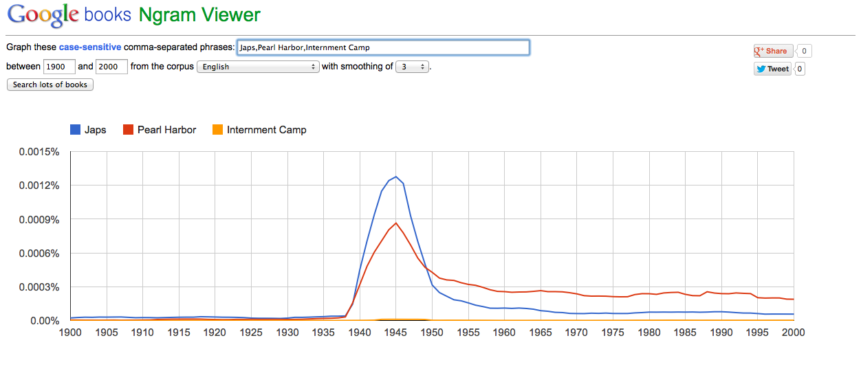
To be honest, I have never heard of Bert is Evil website until I read this essay. Maybe it’s my age, but it just doesn’t ring a bell for me. And when you think about it, that’s kind of one of the main points to this essay, preservation through digital history so people like me can remember something like this site and others like it. In the essay written by Roy Rosenzweig, Scarcity or Abundance? Preserving The Past in a Digital Era (http://chnm.gmu.edu/essays-on-history-new-media/essays/?essayid=6), it discusses the creation and rise to popularity of the Bert is Evil website and due to complications involving Osama Bin Laden after September 11th and the coinciding nature of the Google searches of the two, Bert was then deleted. Just like that.

Children’s Television Workshop, the show’s producers, threatened legal action. On October 11, 2001, a nervous Ignacio pushed the delete key, imploring “all fans [sic] and mirror site hosts of ‘Bert is Evil’ to stop the spread of this site too.”

It’s quite astounding really, how easy it really is to simply just choose something to no longer exist even though it did before with just the press of a button. It makes you think of how much we have actually don’t know about that has already happened. And with the digital scene rapidly growing by the second, we need to take a step back at what becoming digitized means for our society now and for the future.

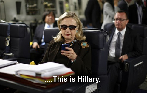
It is important to first consider, what does the digital era mean for historical record? It means more security in the sense that records can be better hidden and protected with the proper coding and digital security system. However, with no actual physical copy of that record, when something in the slightest goes eyry digitally, all evidence of that historical evidence vanishes. What I didn’t know until after reading this essay is that government documents and documents are lost almost everyday because of the digital case in which it locked up in. What is nice though is that the National Archives do preserve their records manually. With that said, the rise of digital use of transferring and storing information is growing and taking over. For example, as the essay points out, Digital sky surveys, for example, access over 2 billion images. Even a dozen years ago, NASA already had 1.2 million magnetic tapes (many of them poorly maintained and documented) with space data. NARA is contemplating archiving military intelligence records that include more than “1 billion electronic messages, reports, cables, and memorandums. And even Secretary of State, Hilary Clinton sends 6 million email messages per year.

Basically, what I am trying to say is that we have entered into a new era. An era where digital preservation is now the norm and the roles between the historians and the archivists are starting the blur and blend as this task of digital preservation becomes much more daunting. Just remember, when people look back at this time 50 or even 100 years from now, what will they remember? What do we want them to remember? And whether Bert is Evil or not, the stories of those who tell can be preserved for the future if we allow it.

Google Ngram Charts

When having to choose between The Time Magazine Corpus (http://corpus.byu.edu/time/) or Google Ngram Viewer (http://books.google.com/ngrams) options, it is safe to say that I much rather use Google Ngram Viewer. For one, Time Magazine Corpus isn’t exactly daunting or crazy intricate, but it does take some decoding at first. I don’t particularly like the layout of the Time Magazine Corpus site visually because of the color. It’s far too bland in my opinion and the whole page just looks like some school assignment that I don’t want to do. The graph very much throws me off as well. Overall, Just not my cup of tea.

However, The Google Ngram Viewer page was much better in my opinion. The colors are simple and clean. Nothing is washed out. The graph is visually unappealing like the Time Magazine Corpus is and I don’t feel like I’m doing my homework (even though I still kind of am). What is also nice about the Google Ngram Viewer is for first time users, such as myself, the site even has an example of how to use the graph by demonstrating with three famous names. Overall, I say the Google Ngram Viewer page is well done indeed.

With that said, I obviously decided to use the Google Ngram Viewer page to complete my assignment by using the words: “Japs”, “Pearl Harbor”, and “Internment Camp” between the dates of 1900-2000 and this is what I came up with:

As you can see there is an influx or peak of all three words during around the late 1930s through the early 1950s. Which is appropriate considering those were the rough dates of World War II. When looking back at past charts used by students in the class, I found it interesting that words that seem to be relevant only in the past 50 or 60 years were somehow used a lot even 200 or 100 years ago, However, with the word Japs it really didn’t even originate till the Japanese bombed Pearl Harbor and had developed as an insulting term to anyone who was Japanese. Same with the term Pearl Harbor. The term didn’t really gain any popularity till it actually got bombed. Another interesting element that I would like to point out is the term Internment Camps, which is where the Japanese Americans were sent to who lived along the west coast. The use of the terms seem to be almost non-existent. However, when you look a bit closer you see there was a slight bump during the time the other two terms reached their peak. Even though interment camps were very real. As real as the term Japs or Pearl Harbor, yet it is almost alarming the differences in curve. To me this indicates that the U.S. government must have made an effort to use that term as little as possible as it can lead to a negative connotation towards something the United States were doing…Just saying.

From Babel to Knowledge

http://www.bookbread.com/wp-content/uploads/2010/09/4a52b079f1bd5708aa0d5c45a6e6b9325edc509c_m.jpg

When reading the article, “From Babel to Knowledge: Data Mining Large digital Collections” by Dan Cohen, I do admit that I had to read it a few times to understand it. But once I got the gist of it, I did find a lot of the information useful. I’ll need more clarification for the practicum element of it, but that will come with further explanation. I didn’t realize how much things have changed, let alone how intricate they are now. The whole process of this is really constantly changing at an alarming rate. This reading was different from past readings I feel because it has less of a text book feel and is more show than tell if that makes any sense. Show in the sense of actual practical application with the combination of how things work technically. This article really brought out the big picture aspect of the project and the different levels of what it has to go through and what it has been going through. Also it’s interesting to be able to take a look at something Professor Cohen has been working on. It was a smart idea to start the article with the story of “The Library of Babel” before diving into the heavy. Otherwise I (and I’m sure other readers who are less experience with this type of topics) would have been overwhelmed and lost. In the story by Jorge Luis Borges, he describes a man wandering through a labyrinth like library searching through unreadable books longing for clarification.

In Jorge Luis Borges’s curious short story The Library of Babel, the narrator describes an endless collection of books stored from floor to ceiling in a labyrinth of countless hexagonal rooms. The pages of the library’s books seem to contain random sequences of letters and spaces; occasionally a few intelligible words emerge in the sea of paper and ink.

To most people or those who study history, philosophy, or literature, this story would have the impact that is supposed to lead inescapable knowledge and understanding. However, for a computer scientist, that is not exactly the case. I think it’s very smart how he was able to compile information from several different sources and combining various collections and methods in order to better the searching and analyzing process. When reading about the syllabus finder and identifying keywords, it reminded me of in class about a month ago when we were discussing search engines and what websites used to do. For example in order for your site to be one of the first to pop up when someone was searching for something you have or show, these websites would try to post the word as much as they could because it used to be the more the word appeared on the website the better chance you have of it being one of the first options for the viewer. It was even to the point where websites would have the particular word on the white background in white colored font hundreds of times so the viewer wouldn’t see it, but it would still be the first option when searched.

Another part of the article that I really found fascinating was when Professor Cohen decided to test the theory by writing a small program to combine Yahoo’s Term Extraction API with a popular online reference source and then testing it by running a search on former President George H. Bush and his son former president George W. Bush.

George H. W. Bush George W. Bush
president bush president bush
saddam hussein office of homeland security
fall of the berlin wall reconciliation act
tiananmen square internal revenue service
thanksgiving day irs
american troops department of veterans affairs
manuel noriega congress
halabja franklin d roosevelt
invasion of panama ronald reagan
gulf war terrorist attacks
help war on terror
saudi arabia aftermath
united nations military spy
berlin wall military airport
chinese military
public aspect
spy plane
democratic parties
security office
approval rating

It’s almost shocking how different the categories of terms that result for both of the former presidents.

All in all, I liked the way that we were guided along this whole article in a way that was easy to follow. I’m still fuzzy on some of the points, but that will be clarified shortly. What I did learn though were the lessons learned from partaking in this experiment: 

  1. More emphasis needs to be placed on creating APIs for digital collections.
  2. Resources that are free to use in any way, even if they are imperfect, are more valuable than those that are gated or use-restricted, even if those resources are qualitatively better.
  3. Quantity may make up for a lack of quality.

Finally, I am very interested in seeing where something like this syllabus finder and others like it will go. It really shows how technology can grow at such an alarming rate. Sometimes we really don’t think about how far something has come until we step back and take a look at where we’ve been.

PowerPoint Assignment: The French Revolution

So when choosing a historical moment to create my PowerPoint presentation, I decided to choose The French Revolution. I thought it was extremely impact full and with the time period and dramatization, I felt that I could do a lot visually with the slides.

The first slide, I thinks reveals enough without revealing too much. I thought the slide background was perfect for the setting in 1789 since ink was the primary writing use. The color gives it an older feeling and the font I felt was appropriate to the time period. It gives it a sense of dramatization. I didn’t want to add an image of the revolution itself, because first people already have a fair sense of the The French Revolution and second I didn’t want to reveal too much in the cover slide. So I felt a worn out version on the French flag was appropriate. Then to provide a different element to it, I placed the motto for The French Revolution, “Liberty, Equality, Fraternity” in the top right corner to give the viewer something to look at in the colors of the French flag. Finally, without giving away too much information about the revolution, I added a quotation from a prominent figure during the revolution to give the viewer a sense of what it must of been like or what it meant to the people back then without actually giving any facts on the revolution that will be revealed in the next slide.

In this slide, it would be considered the facts and information slide. This is usually the slide where you start to lose the viewers attention, so you have to set it up in a way where it doesn’t. For example, I posted only five facts to not overwhelm the viewer and tried not to post too much information onto each of the facts for the same reason. Then for the background, I posted a photo of a map of France in 1789 so show how it was during the revolution. This map had the right colors for the feel I was trying to portray and I was able to make it transparent in order to not overpower the content. At firs that was difficult, but I eventually figured it out and I think it looks visually appropriate.

Finally, I decided to close it out with a power painting of The French Revolution. I didn’t choose to add a description of the painting because I didn’t want to distract the viewer from a painting where so much is going on. I feel like it speaks for itself as well. With the bodies lying around to signify their struggle and the people of France’s triumphant battle holding up the French flag signifies what the revolution mean to the people of France.

Is PowerPoint Good or Evil?

http://www.ils.unc.edu/courses/2010_fall/inls461_003/images/tasks/task06.presentation/task06.sessions/PPT.NewYorker.cartoon.gif

Is PowerPoint good or evil? Well, after reading the article written by Edward Tufte, it is very clear where he stands…PowerPoint is as evil as it comes. But from my experiences with PowerPoint, I think that it can be effective it used correctly. This isn’t the first time I’ve heard people complain about PowerPoint and how it is the essence of true evil, and frankly, it it kind of annoying. PowerPoint is just a presentation method that can sometimes get out of hand. But honestly, ANYTHING can get out of hand if not used properly, so why are we all of a sudden chasing PowerPoint with torches and pitchforks? Yes, there are things that can go easily wrong in PowerPoint. You shouldn’t put too much information on one slide or else people won’t care to read it. You shouldn’t put too many bullet points on a slide or the same will happen with not wanting to read it. The pages shouldn’t be overloaded decoration wise or the viewer will be overwhelmed with all the colors, fonts and images. Also, because it is also supposed to be accompanied with a speaker as the slides go along, the viewer tends to not really focus on the slides and just listens to the speaker. Or the opposite, where they won’t focus on the speaker at all and just try to decode the slides. As someone who partakes in public speaking for the speech team at this university, you need to grab their attention fast and keep it, because once you lose them, it is very hard to win them back. I think PowerPoint could be a great presentation and communication tool if we allow it to be. There are so many things that it can do. You can ad the images you need to best illustrate what you are trying to say. You can attach videos easily when you want to show a demonstration, and there are bullet points on the slides to best sum up what you are saying. And because there are so many different styles of PowerPoint (with is being updated constantly) you can very easily show what you are trying to say with a specific font, image, or background custom to your topic. So when answering the question is PowerPoint good or evil? I would have to answer it is inherently good, but I guess could become evil if placed into the wrong hands. I think that Tufte is being a little harsh when discussing PowerPoint and not highlighting what it could do verses highlighting what it could destroy. Also, his argument about if the content is boring then you need better content is a little obscure and unrealistic. Sometimes your in a situation whether it is work or a school project where you have to present something with very specific sets of criteria. What then?…get new content? Well, you kind of can’t. What you do then is gather the information you can and present it in a manner that will make the viewer want to listen. Again, coming from a public speaking perspective, sometimes you’re not presenting the most amazing materials, but you just have to present it in a way that sells it. In addition, PowerPoint can be the faithful ally you need in order to make them listen and keep listening. Communication has no limits, why should we limit PowerPoint?

Historical Chart Data

For the practicum for week 8, creating a google chart using historical data. I decided to created a chart showing the states with the highest Asian-American Demographic in the United States in 2011. At first, I didn’t know which chart to use, but I felt that the circle chart would best reveal the data in the clearest way. I went on Wikipedia to research the data on the demographics and calculated the top four states with the most Asians present. I could of used more states or all 50 states, but I felt like that would be too much and excessive so I just narrowed it down to the top four. As you can see, Hawaii’s population of Asian’s is enormous. That obviously has contributed to it’s proximity to Asian itself. The same goes for California.

Felton Report

So when doing some research on Nicholas Felton, it is quite amazing what he has accomplished off of something that can easily be so simplistic. By recording something as basic as his yearly activities, he has done so in a way and style that is truly original. His creativity has even landed him publications in the Wall Street Journal, The New York Times, and Good Magazine; and has been recognized as one of the 50 most influential designers in America by Fast Company AND has been credited for creating facebook’s new timeline format that is seen by millions today. But what is it about his reports about his yearly activities that has landed as such a credited designer?… Well at first, I didn’t think they would be THAT  intricate, but then I investigated a little bit further..

For example, he starts at 2005 up to the most recent report in 2011. And the differences in intricacy are undeniable. In fact, they have become almost unreadable. To elaborate, here is a report from calculating where he’s traveled in the year of 2005:

Ar05

As you can see, it’s pretty straight forward, but still thorough. He shows where he has traveled abroad, where he’s traveled in the United States, the amount of flights, the average distance, air miles traveled, and what percentage that would equate to in relation to the distance from the earth to the moon to give you a good sense of how far he’s gone. The categories are separated in four readable squares to properly organize them, accompanied with an image of several tall buildings to make it ecstatically pleasing. In my opinion, this is a very good report. It’s not more than it needs to be, but all the elements to make it effective and impressive are still there.

Now in contrast, here is The Felton Report of the same situation (travel) but in 2011:

AR 2010/2011

As you can see, the difference from the 2005 travel report could not be more different. For me, it is almost unreadable. For example, the writing is too small to read, there is just too much detail for me to even want to stay focused, I don’t know the purpose of he specific illustrations, and I don’t understand the purpose for the placing. The way the images overlap for New York specifically is just unreadable and exhausting. You really have to go out of your way to try to truly understand this particular report and I doubt many people really care to.

I don’t know if this means his life has become extremely intricate and more exciting in the past 6 years, but I doubt it. It is almost as if throughout the years he is attempting to prove how precise he can be. However, if everyone is too confused to even care to understand it then what’s the point. It’s as if he is just trying to show off at this point. When I first looked at these reports, I thought they were for some huge corporation or something involving business, because I didn’t really care to look further. But when I did, and realized it was just about his life activities, I got the impression that the whole thing is kind of a lot. Each year, it seems like he must top himself in detail to prove his improvement and credibility. But who knows, maybe people really like that..