Introduction:
During the 1942, after the bombing of Pearl Harbor, the initiation of the United States’ involvement World War II had just initiated, and incarceration of thousands of Japanese-Americans along the west coast was made official for the crime of simply having Japanese heritage. It was during this time that Officer War Information Direction, Elmer Davis recommended to President Roosevelt that there should be a military service should be initiated where only all Japanese-Americans could voluntarily enlist. It was then that about 4,000 Japanese-American men or the Nisei men trained and fought as United States soldiers to fight in Europe creating the 100th Infantry Battalion and the 42nd Regimental Combat Team in 1944. They are later known as the Go For Broke Battalion. Through constant struggles and ruthless determination, The Go For Broke Battalion saved numerous lives and won several awards making them one of the most awarded regiments in the history of the United States. The purpose of this project is to discover where these men came from and what they had to go through, training and battles they encountered, and the awards and effects of the Go For Broke Battalion who stepped up from their discrimination to fight for the country they belonged to.
Slide 1:
Cover slide.
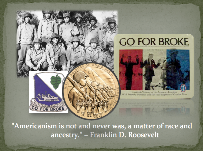
Slide 2:
This slide was meant to give a sense to who the Go For Broke Battalion is with a few simple yet powerful images along with a picture of some of the soldiers involved, the military symbol for this specific Battalion, the gold medal crest, and the cover of the book dedicated to the Battalion that is used and cited in this project. Along with the images, is a quotation from the president at the time, Franklin D. Roosevelt that I really feel embodies the purpose of the project.
Slide 3:
This slide helps place the framework of what happened before the Battalion started, how it came to be, what they went through, and their significance.
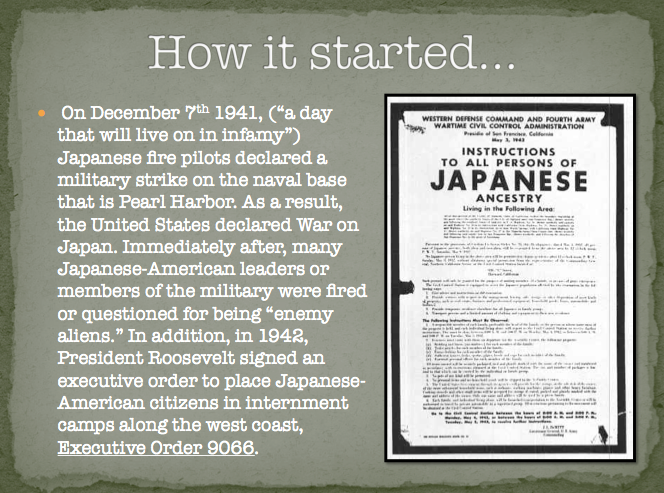
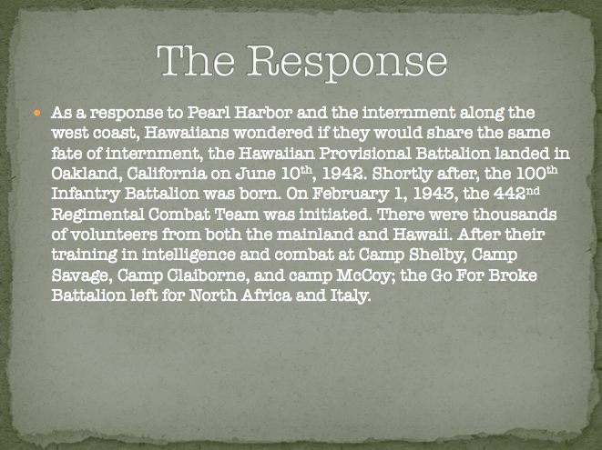
Slide 4:
This next slide goes more in-depth into what occurred in the United States that started the whole process of the Battalion. Everything started with Pearl Harbor that later lead to the United States War against Japan. As a result, Japanese-Americans were questioned and the Executive Order 9066 was signed by President Roosevelt to intern Japanese-Americans on the mainland of the United States.
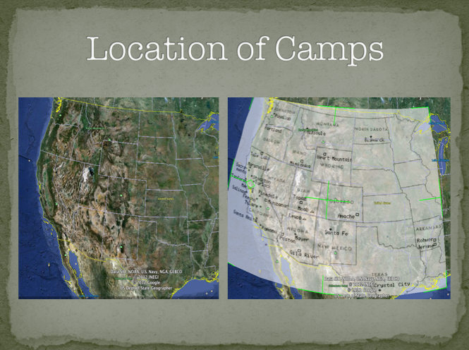
Slide 5:
Next to add more effect to the Internment camps, I provided a map of the the west coast region of the United States where the camps were located. The second map is an overlay map that I created from Google Maps that shows the exact location of the camps.
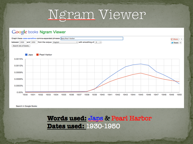
Slide 6:
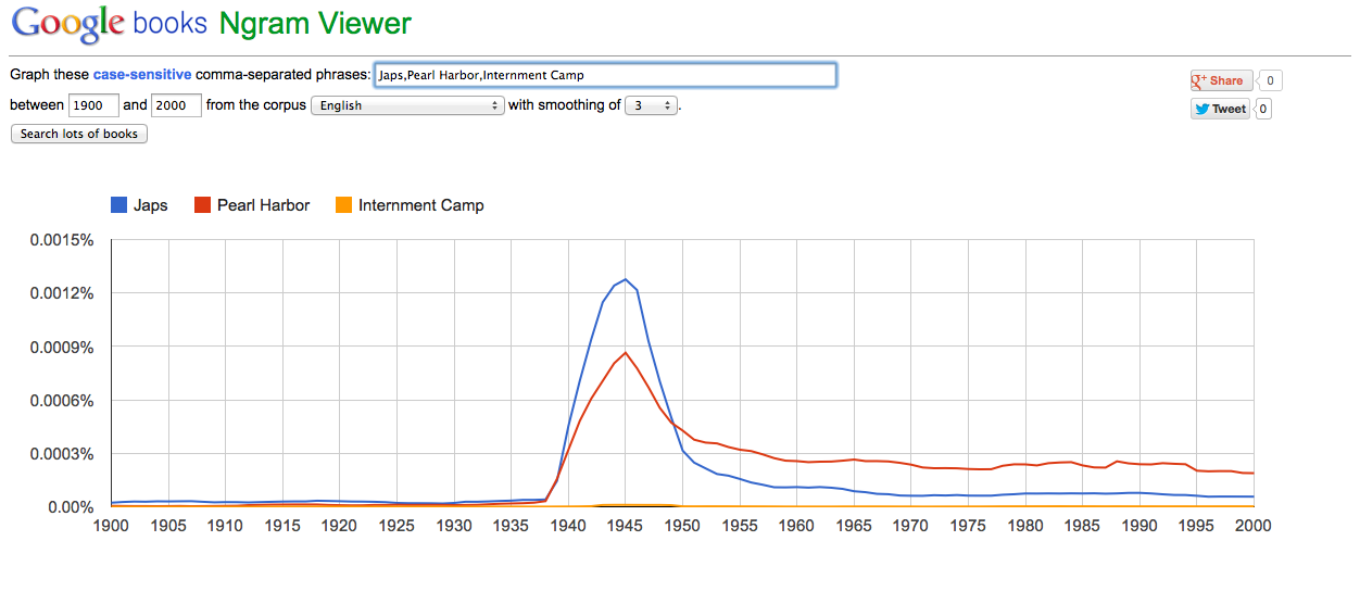
This next slide, I used the Ngram Viewer to show how this time period really affected the use of certain words relevant to the event. The words I used were “Japs” and “Pearl Harbor” in between the times of 1930-1950, the times outlining world war II. One is a derogatory word toward the Japanese and the Other signifies an important event that sparked World War II. As you can see, there is a clear peak of these two words right when Pearl Harbor occurred and drift down as the war comes to an end, but doesn’t really diminish completely.
Slide 7:
In this slide I go into more detail about how the following events presented caused many Japanese-American men to feel compelled to Join a specific all Japanese-American Battalion to fight for the United States, where they trained and when each battalion was created.
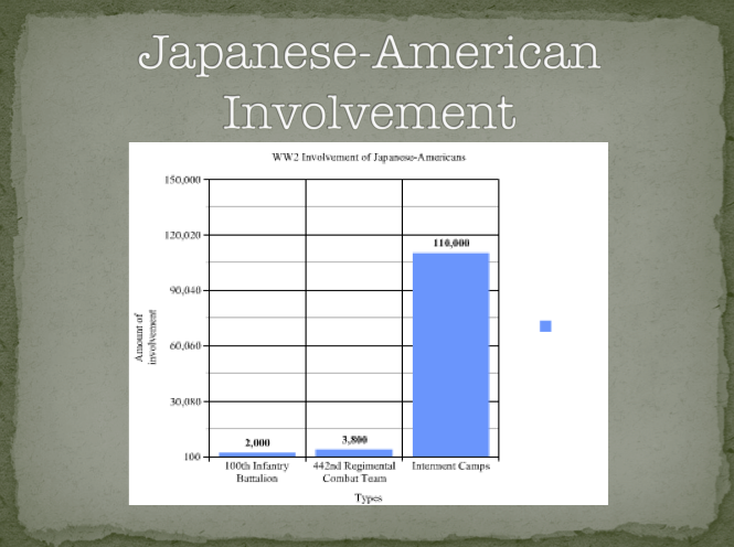
Slide 8:
This slide is a bar graph that represents the Involvement of the Japanese-Americans in each the 100th Infantry Battalion and the 442nd Regimental Combat Team. I also included the amount of Japanese-Americans who were interned in 1942. As you can see, despite the fact that thousands of Japanese-Americans enlisted in the military, the numbers don’t even rival to the amount of people who were interned. Thus showing the motivation behind the people of the Battalion giving them something to fight for.
Slide 9:
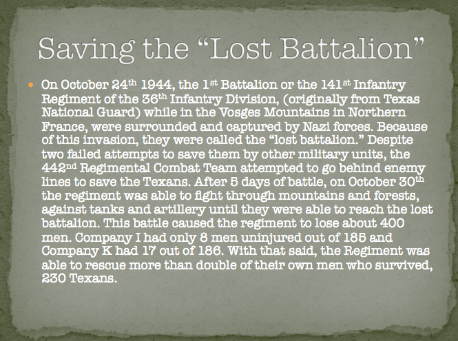
To give more of a window into what the Battalion did, I provided a in depth description into one of the Battalion’s biggest accomplishments, The rescue of the Lost Battalion. The point that I would like to emphasize is the amount of Japanese-Americans who died in order to save a number of Texas soldiers who’s numbers of survival double the amount of people who survived in the Battalion.
Slide 10:
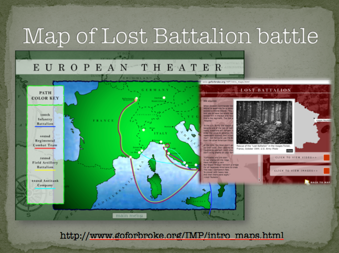
This slide is to present a visual element to the Lost Battalion that was described in the previous slide. There is map of where the Lost Battalion was rescued and shows how far they had to travel to get there. There is also an image of the Battalion trudging through the forest to retrieve them. And finally, I have provided a link to an interactive map that shows all the locations the Battalion had fought and set camp in both Europe and the Pacific.
http://www.goforbroke.org/IMP/intro_maps.html
Slide 11:

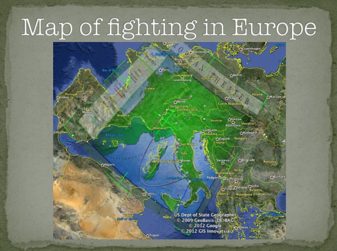
This next slide is another overlay map showing where the Battalion primarily fought in Europe. The overlay is a map that shows the specific spots of the Battalion’s battle sites. As you can see the places where the Battalion was placed are mostly along Italy and a scarcely in France and other countries as well.
Slide 12:
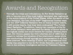
Next, this slide expresses the awards and recognition that the Go For Broke Battalion had won. As you can see, from the previous slides about the Lost Battalion many men from the Go For broke won so many purple hearts they were nicknamed the “Purple Heart Battalion.” With all of their many accomplishments, they become the most decorated military group in the history of the country.
Slide 13:

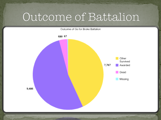
To some up the graphs, this slide represents the outcome result of the people in the Go For Broke Battalion. As shown, the graph exemplifies those who were awarded, those who survived, those who died, and those who went missing. From the previous slide about awards, this graph really shows how highly decorated the Go For Broke Battalion really was.
Slide 14:
And finally, my last slide is my conclusion slide. This slide sums up the thoughts and major ideas that are present throughout this final project. This slide brings up how The Go For Broke battalion is not as known throughout this country as it should be considering the sacrifices that the Japanese-Americans had made. I concluded with my personal connection to this topic and about my Grandfathers involvement with the Battalion.
Slide 15:
Reference page
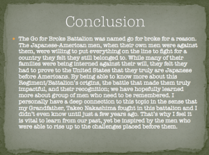
Conclusion
The Go for Broke Battalion was named go for broke for a reason. The Japanese-American men, when their own men were against them, were willing to put everything on the line to fight for a country they felt they still belonged to. While many of their families were being interned against their will, they felt they had to prove to the United States that they truly are Japanese before Americans. By being able to know more about this Regiment/Battalion’s origins, the battle that made them truly impactful, and their recognition; we have hopefully learned more about group of men who need to be remembered. I personally have a deep connection to this topic in the sense that my Grandfather, Takeo Nakashima fought in this battalion and I didn’t even know until just a few years ago. That’s why I feel it is vital to learn from our past, yet be inspired by the men who were able to rise up to the challenges placed before them.
Preservation
In order to not let the memory of The Go For Broke Battalion vanish I must be prepared to go through the steps to preserve as much as I can. First, I would keep my information safe by keeping by the system of LOCKSS (Lots of Copies Keeps Stuff Safe). I would email the power point project to myself, and the professor. Next, I would be sure to save the project on a flash drive and on my external hard drive. I would be sure to have physical copy of the power point to have on hand if the electronic versions are not the most reliable.
However, I would still like to take more of a proactive initiative approach to preserving this project on the Go For Broke Battalion. I would contact organizations that are dedicated to this organization and preserving its legacy. From doing my research, I have found that there are site about the Go For Broke Battalion that are focused on various elements such as specific battles, its initiation, specific people, timelines, awards, and which people involved who are still alive. I would contact them and try to do research with them and hope this project contributes in some way while in result preserving the Go For Broke Battalion even more. And if that all fails, I will create a website about the Battalion containing the information, if not more, that I have provided in my project.